Famous Logos in CSS3 – Batman
The second famous logo in the series we’ll be attempting to re-create with CSS3 is the Batman logo!
Last week we looked at the Pepsi logo, which was relatively simple with only three blocks of colour to manipulate into the appropriate shapes and position. The Batman logo is a bit more tricky, occupying a much more comprehensive shape than the Pepsi logo.
I took on some advice from Chris Coyier of CSS Tricks after last weeks effort, who advised using the :before and :after pseudo-selectors in order to minimise the number of divs. This would prove especially useful advice in creating the batman logo, as I had initially counted up a total of 11 div elements in order to recreate the symbol. However, with the help of the aforementioned pseudo-selectors, I managed to reduce this number to just 6.
Browser Support
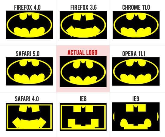
Browser support for the CSS3 Batman logo is a little sparse generally, but it’s pretty solid among the most recent browser releases.
It’s important to note that the reason it isn’t rendering correctly in some browsers is because the :before and :after pseudo-selectors in these browsers don’t recognise certain properties, namely the border-radius and transform CSS3 properties.

So Firefox 4, Chrome 11, Opera 11.1 and Safari 5 all render the logo correctly, but IE9 proves to be the only latest major browser release to fall victim of the pseudo-selectors. You can see that a few of the elements have rounded corners, proving that IE9 has no problem rendering them, but it does when using :before and :after!
A couple of the older versions of Firefox and Safari also have trouble rendering CSS3 properties when using pseudo-selectors.
They would render correctly if we used extra HTML markup instead of using the pseudo-selectors, but this series is all about experimenting with CSS3 and re-creating these logos in the most efficient way possible and then taking note of browser-support rather than doing eveything possible to achieve it.
How close is it to the real thing?
On first glance I feel it looks pretty accurate, but when directly compared with the real deal, side by side, you can notice a number of differences. It needs quite a bit of tweaking to get it to a state where it would be hard to tell the difference, but overall I’m pretty pleased with the outcome. You can clearly see it’s the batman logo and only when it’s put next to the real thing can you really see the differences.
The Pseudo-Selectors
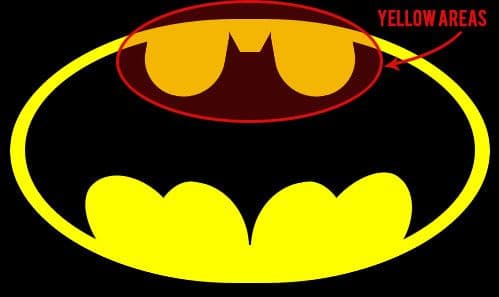
Enough talk about them – what do they actually do? They are actually really easy; the one’s we’re using simply add content before or after an element. In this case, I created one div for the yellow areas at the top of the batman symbol, as shown below.

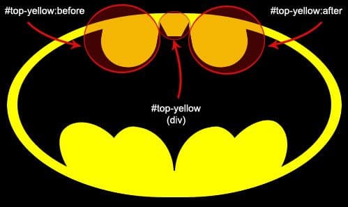
Usually, you might would use three divs to create each of those three yellow elements, but in this case, we’re only going to use one div; <div id="top-yellow"> for the middle yellow bit and then for the left and right yellow bits we can use #top-yellow:before and #top-yellow:before as you can see below.

Simple, right?! One last thing – when using these pseudo-selectors we need to specify the content like so…
#top-yellow:before {
    content:"";
}
Now usually, you’d insert some content within the speech marks such as “This is a yellow div” and then this content would appear immediately before any elements with an id of #top-yellow. In this case, we’re just styling the pseudo-element so we don’t require any content.
And there we have it, the batman logo recreated using CSS3, pseudo-selectors and 6 divs! Again, if you have an even more efficient way to achieve my result, I’d love to see it in the comments section!