Popovers and Anchor Positioning - A Match Made in Heaven
In my previous article, I wrote about how the <dialog> element just got a bit of a glow-up thanks to the new [closedby] attribute and command invokers, bringing it to functional parity with its cousin, the popover attribute - the subject of this post.
As well as Popovers, we're also going to look at the new CSS Anchor Positioning feature, which pairs perfectly with popover. This combination is extremely useful for common UI elements such as dropdowns, tooltips, mini-carts, floating menus and more.
Let’s dive in.
What We'll Cover
- What are popovers?
- A practical example of the popover attribute(s) in action
- How popovers differ from
<dialog>s - Auto vs Manual popovers
- CSS Anchor Positioning and how it fits in
What is a Popover?
The new Popover API allows you to trigger small UI elements (like tooltips, floating panels or cards) into view with other elements on your page, using pure HTML (literally just a couple of attributes!).
You get built-in light-dismiss behaviour (click outside to close), better semantics, and of course less JavaScript! All you need is the popover attribute, and a trigger element using popovertarget:
<!-- Trigger button -->
<button popovertarget="info-pop">More Info</button>

<!-- Popover element -->
<div id="info-pop" popover>
  <p>This product is made of 100% CSS magic.</p>
</div>
Out of the box, you get:
- Toggling support (via
popovertarget) - Built-in ESC-to-dismiss
- Click-outside-to-dismiss (if auto mode, more on that soon)
- Correct ARIA semantics and focus handling
- Always sits on a new layer above the rest of the DOM
You also get:
::backdroppseudo-element for custom background styling:popover-openpseudo-class to style the popover when it's shown
This works great for dropdowns, tooltips, and transient UI patterns (like a toast notification).
Popover vs Dialog: What's the Difference?
This can be rather confusing, because they're two different things which do very similar things, and there is some overlap between them; they can even be used together in some circumstances.
- Out of the box,
<dialog>lacks the ability to click-outside to close and also needs JavaScript to toggle it on and off. Unlike popovers. - Popovers don't trap focus or make the rest of the page inert (un-focusable). Unlike dialogs.
It's easy to stick the popover attribute on a <dialog> element to get the light-dismiss behaviour, but this is a misuse of popover—unless your popover warrants being a <dialog> element semantically (more on this below).
And it's also unnecessary now, as those dialog functionality holes have been filled by the closedby attribute and command invokers (as explained in my last article).
In terms of the correct semantic usage, a <dialog> makes sense when your popup has rich, structured content that requires user action (such as a confirmation button). A popover makes sense for lighter popups such as tooltips and notifications. But what about that overlap I mentioned earlier?
The Curious Case of <dialog popover>
Yes, it’s technically valid. And in very specific cases, it can be semantically useful. Chrome's Popover API blog post gives a "Quick Shop" example:
<dialog id="quick-shop" popover>
  <h2>Product Title</h2>
  <button>Add to cart</button>
</dialog>
In that case, the dialog gives the content semantic structure, but the popover behaviour is what you want: lightweight, no focus trap, no background lock.
This makes semantic sense if you want a content-rich, structured, interactive panel, but you don't want to block the user or completely take them out of the flow of the page. Examples might include a mini-cart, login popup and of course this quick shop card.
Auto vs Manual Popovers
There are two modes:
Auto Popovers
- Dismissed when the user presses ESC or clicks outside
- Default mode
Manual Popovers
<div id="settings-menu" popover="manual">
  <p>Menu content</p>
</div>

<button popovertarget="settings-menu" popovertargetaction="show">Open Menu</button>
<button popovertarget="settings-menu" popovertargetaction="hide">Close Menu</button>
With manual popovers, you have full control over how and when they're shown or hidden, but you still don’t need JavaScript. The popovertargetaction attribute accepts values of show, hide, or toggle.
Use manual if your popover is part of a more complex component that shouldn't close when the user clicks outside it.
CSS Anchor Positioning
This is where things get really fun.
Anchor Positioning and popovers are a match made in heaven (but anchor positioning is by no means limited to popovers).
The Basics
At its core, anchor positioning connects two elements:
- Anchor element: the reference point
- Target element: the one you want to position
You assign anchor-name: --name; to the anchor element, and anchor: --name; to the element being positioned, which establishes the relationship between the two.
#button {
  anchor-name: --my-anchor;
}

#tooltip {
  position: absolute;
  anchor: --my-anchor;
  position-area: bottom center;
}
However, when used with popovers, you don’t even need to define anchor-name manually. The popover will automatically anchor to its trigger button (told you they worked well together!).
So this is all you need:
<button popovertarget="tip">Hover me</button>
<div id="tooltip" popover>Tooltip here</div>

#tooltip {
  position: absolute;
  position-area: bottom center;
}
The position-area Property
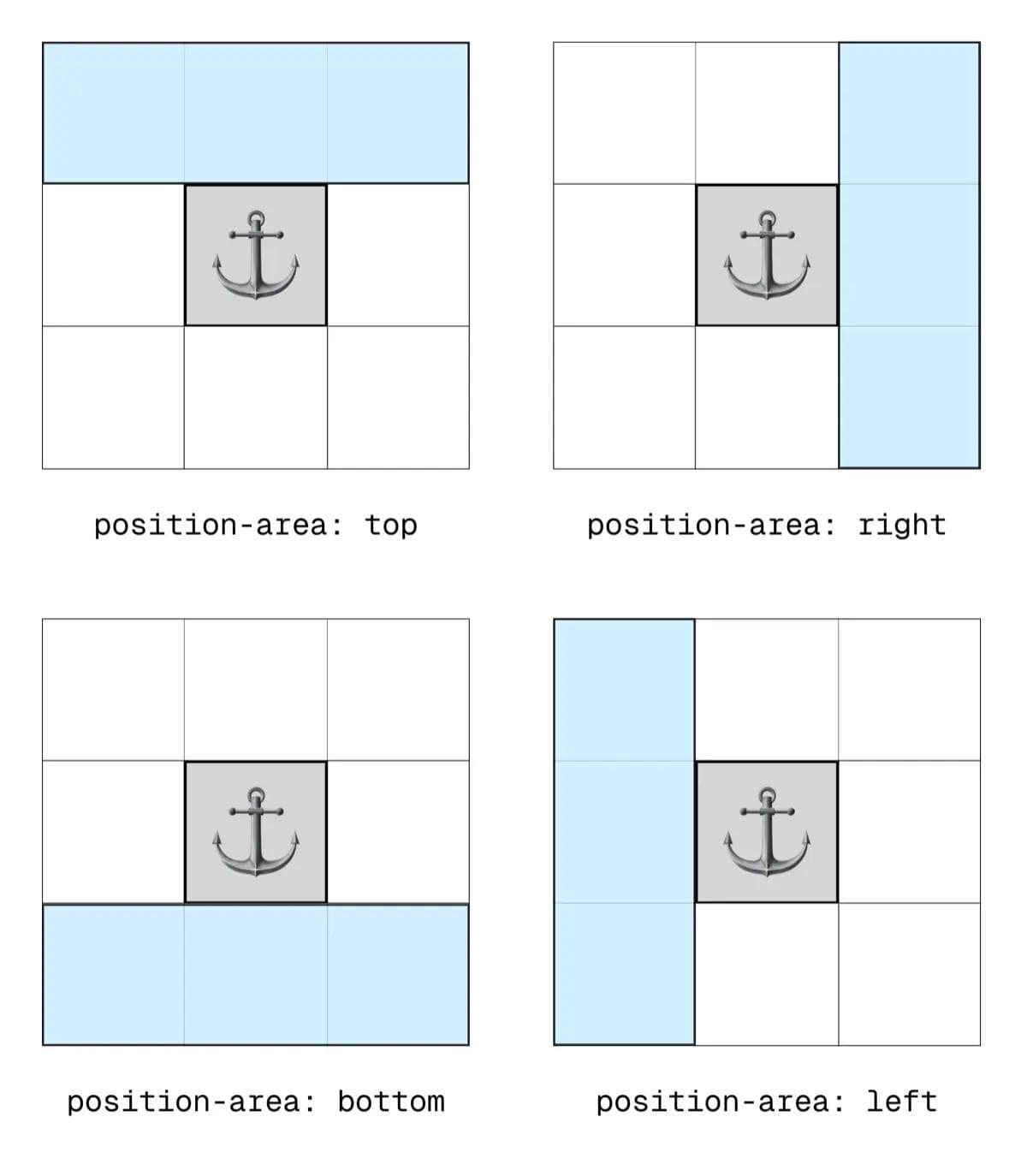
So what is that position-area property doing? It essentially treats the anchor as the centre of an imaginary 9×9 grid. You can then place your popover element into that grid using combinations of the following keywords:
topbottomleftrightcenterspan-topspan-bottomspan-leftspan-right
First of all, let's look at how the top, bottom, left and right values behave:
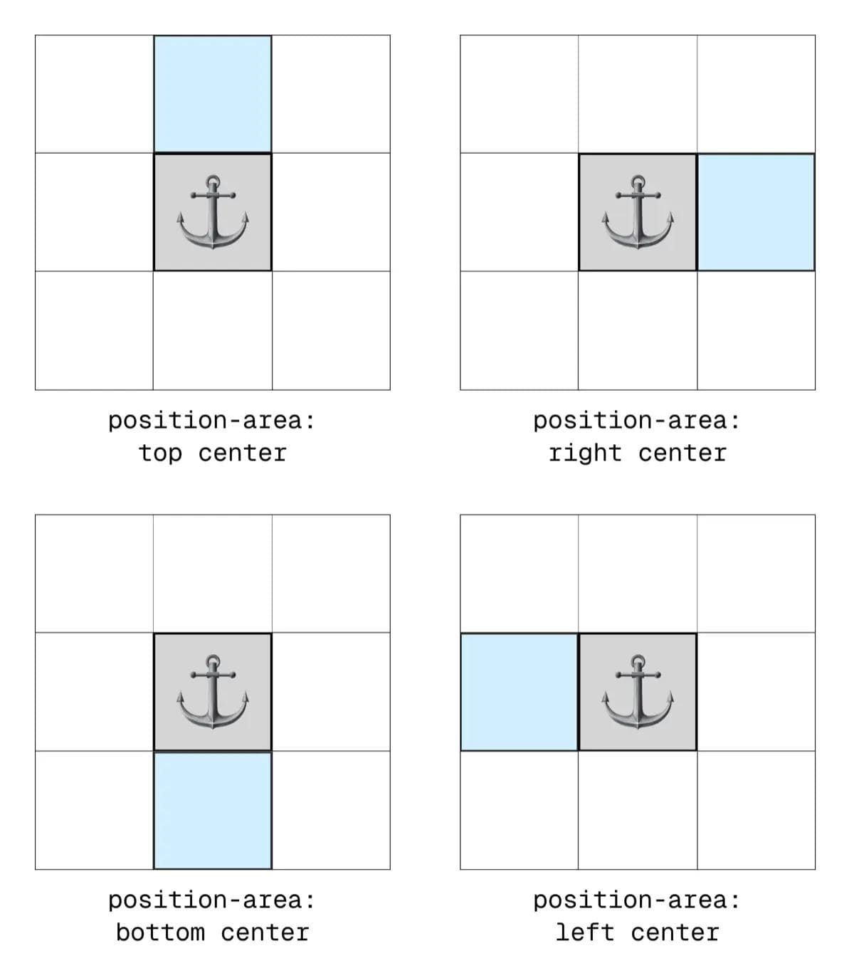
Now let's look what happens when you pair those values with the center keyword:
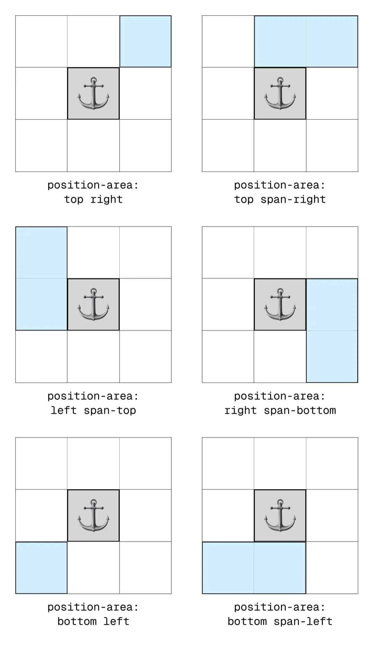
You might have guessed you can also combine the 4 key positions to place the element in the top right grid square for example, or the bottom left, etc.
But what about those span-* values? Let's see some examples of how they work when paired with the base positional keywords:
If you're still struggling, this helpful tool from Google provides a nice way to visualise the different value combinations.
Fallbacks: The Real Superpower
The real ace-in-the-pack with CSS Anchor Positioning is the fallbacks mechanism. I'm sure you've experienced times when, for example, you've positioned a dropdown menu to the right of a navigation item, but on smaller screens there's no longer enough room for it, so it overflows the viewport. Well rather than letting it overflow or get cut off, you can now define fallback positions!
The position-try-fallbacks Property
This property can be used in a few different ways, the most basic of which is by using any valid position-area value, like this:
#menu {
  position-area: right;
  position-try-fallbacks: bottom center;
}
In this example, the browser will try to place it on the right, and as soon as there is no longer sufficient room, it will shift to the bottom center position.
There are also some predefined keyword values available to use:
flip-inlineswitches the position of the target element horizontally, so from the left side of the anchor to the right (or vice versa)flip-blockswitches the position of the target element vertically, so from the top side of the anchor to the bottom (or vice versa)flip-startswitches the position on both axes, so essentially flips the position diagonally
You can also include multiple different fallback values to try by comma separating them.
#menu {
  position-area: right;
  position-try-fallbacks: flip-inline, bottom left;
}
And that's not all. You can achieve much greater control by referencing a named @position-try at-ruleset...
The @position-try at-rule
This lets you define custom named layouts with full property control:
@position-try --myfallback {
  position-area: bottom center;
}

#menu {
  position-area: right;
  position-try-fallbacks: --myfallback;
}
You can include any styles you want within the @position-try ruleset, which makes for quite a powerful feature.
This makes common UI like dropdown menus responsive by default. You can design it to appear beside the anchor on large screens, and below it on smaller screens without writing a single media query or JS resize handler.
The anchor() Function
I wanted to keep things fairly straightforward in this article, as there is a lot to the CSS Anchor Positioning API, and different ways to approach things.
Something I'm not going to go deep on here is the anchor() function, which can be used as a value of the traditional top/left/right/bottom positional properties as an alternative way to position your target element to its anchor. I personally find the position-area method more intuitive.
Want to go deeper? CSS Tricks has a great guide on Anchor Positioning.
Animating Popovers (and Dialogs)
Animations and transitions can be tricky with these native popups, because popovers/dialogs use display under the hood, which you probably know can't be animated... well, they couldn't.
Amazingly, it’s now possible thanks to two new CSS features:
@starting-style- lets you declare pre-animation stylestransition-behavior: allow-discrete- enables animations even whendisplayis toggled
I may cover this properly in a separate post, but I did also write about it in my What's New in CSS app.
Wrapping Up
The new Popover API and Anchor Positioning are game-changers for web UI.
Native HTML and CSS are catching up fast, and it’s genuinely exciting to see how much of the web’s component boilerplate is being replaced by elegant, built-in browser solutions.